2021 Colors and Palettes of the Year
THESE ARE THE GENERAL 2021 PAINT COLOR TRENDS I SEE:
Colors are getting deeper and more saturated.
Gray is OUT and greige to beige are the new warm neutrals.
Warmer colors are the new standout this year.
Bronze is now the new neutral replacing black.
Blush is moving to deep warm rose.
Blues and greens are still popular, now with mainly gray or yellow undertones.
“I truly believe PAINT IS MAGIC!”
It is the most affordable way to update a room, cabinets or a piece of furniture.
Now let’s look the paint manufacturers 2021 Colors of the Year.
BENJAMIN MOORE AEGEAN TEAL 2136-40
First up is Benjamin Moore and I am OBSESSED with this color .The team at Benjamin Moore, in turn, has transitioned from the dreamy, break-of-day wistfulness of 2020’s Color of the Year, First Light (2102-70) to a 2021 hue that anticipates a full and fruitful morning. “Aegean Teal (2136-40) is an intriguing blue-green that creates natural harmony and invites us to take a moment to reflect and reset,” says Hannah Yeo, Benjamin Moore Color Marketing and Development Manager. “Aside from the kitchen, Aegean Teal works great in bedrooms, cabinetry, living rooms, offices, entryways and mudrooms.”
BENJAMIN MOORE Chestertown Buff HC-9
We love Chestertown Buff (HC-9), a muted maize that evokes autumn afternoons: pair it with crisp, dark tones and wintery whites in an entryway to celebrate the change of the seasons. “Paired with natural materials such as wood, stone and brick, these colors help to create a warm ambiance and play to the senses.”
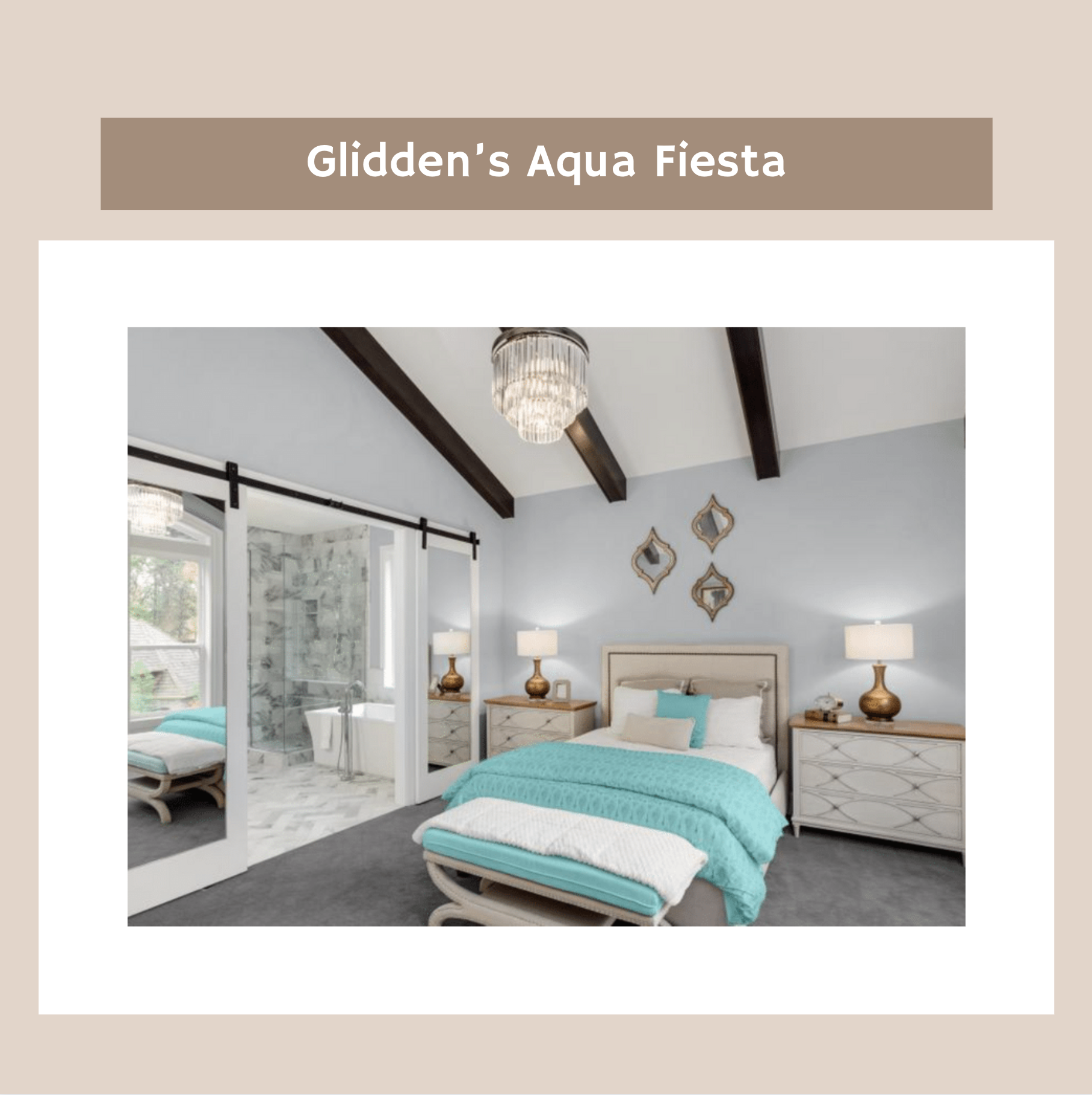
Glidden’s Aqua Fiesta
The color experts at Glidden have been forging their own path (and palette) in recent years: instead of naming a Color or Palette of the Year for 2020, they crowned Whirlwind (PPG1013-3) — a versatile pale grey with hints of lavender that's pictured on the wall both here and in the next slide — an all-time favorite to love for the year to come and beyond. There’s a curveball in their announcement for 2021 as well: Aqua Fiesta (PPG1147-4), a fresh and congenial marine tone, is the Accent Color of the Year. Their point is well taken: this festive hue enlivens neutral spaces and lifts spirits like a glimpse of crystal-clear tropical water after a long spell of being homebound.
Sherwin-Williams’ Urbane Bronze
“Complement the simplicity of Urbane Bronze with natural materials — like wood finishes, organic stone accents or woven textiles — and a variety of mixed metals to create a serene space grounded in nature,” Sue recommends. The color’s anchoring quality makes it a new-neutral powerhouse that serves well in spaces like living rooms and dens, as well as sanctuaries like bedrooms and home offices. To find complementary tones and inspiration, explore the Sanctuary palette from Sherwin-Williams’ 2021 Colormix Forecast: “The ‘stay at home’ mantra has directed where we go and what we do in 2020, but it will also influence interior design trends for 2021 and beyond,” Sue predicts.


